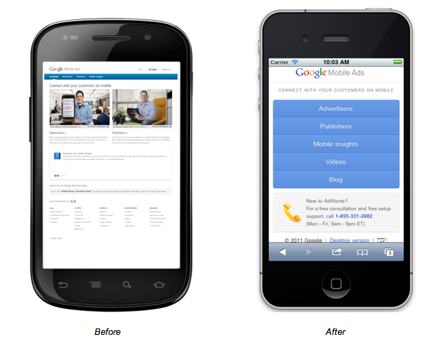
In addition to practicing what we’re preaching, there were important reasons to build a mobile site. Use of the mobile web is accelerating and there are now 96 million smartphones in use in the US.[1] That number becomes much more tangible through the lens of your own analytics data. When we looked at our site, we observed a rapid increase in mobile visits over the past year. Today, nearly 10% of overall traffic to our Mobile Ads website comes from mobile devices. That’s hard to ignore.
We realized that our mobile users were having a really poor experience when accessing the desktop site via a mobile phone. Furthermore, we were wasting 10% of our efforts in marketing the site. Again, the data didn’t lie: the site’s bounce rate from mobile devices was above 60%, more than double the bounce rate from desktop users. Clearly something was up.
How did we do it? I sat down with a webmaster here at Google - Jerome Senaillat - and together we shaped the content and features that would work best on mobile. The process was surprisingly quick: we had a near-final working version of the site in just four weeks, without working on the project full time. We followed this list of ten best practices when designing the site, focusing on three which would greatly improve the experience for a mobile user:
- Design for visibility: the problem with the homepage was that none of the content could be read without causing eyestrain. The solution was drastic: we abandoned the images on the homepage and replaced it with an easy-to-read, simple-to-navigate menu.
- Keep it quick: using our analytics data we were able to identify the most popular content consumed by mobile users on our desktop site - such as our mobile insights page - and made it quick to access from the homepage of the mobile site.
- Make it easy to convert: a primary goal of our site is drive people to try mobile ads by creating an AdWords account. We optimized that experience for mobile users by connecting them to a call center where an advisor can create the account on the fly. We set up a separate phone number to track calls.
We’re excited about the early results we’ve seen since launch. Already, we’ve noticed that mobile users are staying on the site twice as long as they did before.
Jerome and I recorded a short video to explain what we did in a bit more detail, you can check it out below. It was easy to GoMo and we hope you’ll GoMo too!
Posted by Mike Schipper, Google Mobile Ads Marketing
[1] CTIA, October 12, 2011.
GoMo: How we mobile-optimized our own mobile ads website
Rating: 100% based on 975 ratings. 91 user reviews.
Rating: 100% based on 975 ratings. 91 user reviews.

Tidak ada komentar:
Posting Komentar